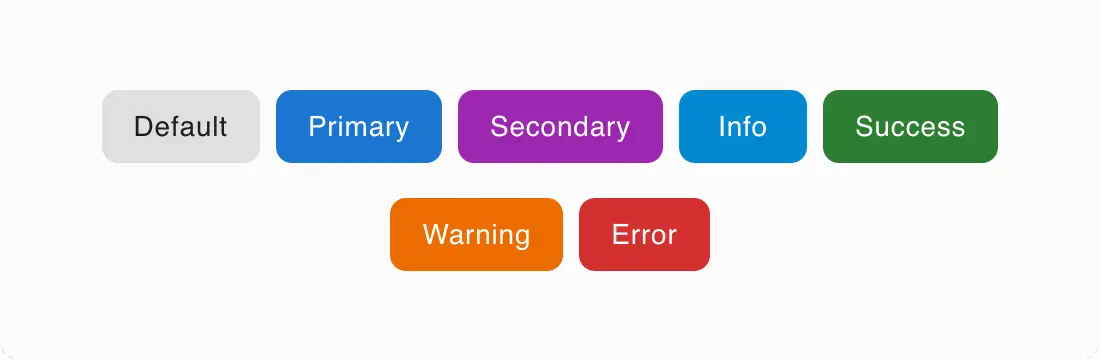
Global overrides MUI components
Customize and override MUI components globally by modifying files in the directory: src/theme/core/components
🎨 styleOverrides
- Customize the styles of MUI components globally using
styleOverrides. - 📘 Official docs – Style overrides
⚙️ defaultProps
- Set default props for MUI components globally using
defaultProps. - 📘 Official docs – Default props
src
  ├── theme/core/components
    ├── accordion.jsx
    ├── alert.jsx
    ├── appbar.jsx
    ├── ...
...
// src/theme/core/components/appbar.tsx
const MuiAppBar: Components<Theme>['MuiAppBar'] = {
defaultProps: { color: 'transparent' },
styleOverrides: {
root: {
boxShadow: 'none',
},
},
};

🔗 Reference:
The change will apply globally for MUI component.
This helps you to deeply customize your style, to suit your design.